World Food Program – wfp.org
1. What do you think the main goal of the website is?
– To end hunger for good, and to get people to give money to those in need
2. What elements in the design are helping the users meet the website’s goals? (Look at the calls-to-action, navigation, and other design elements.)
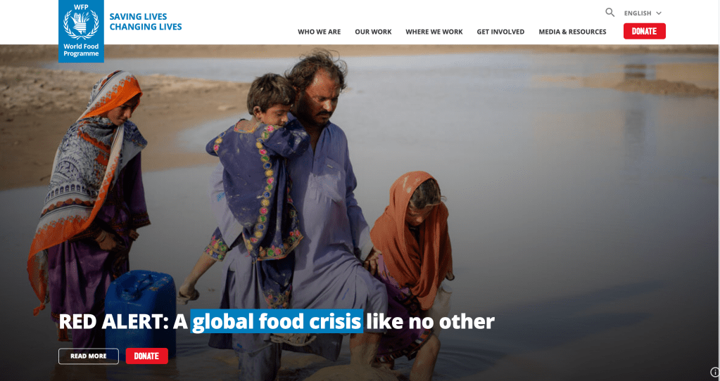
– When we first enter the website, we encounter a picture of a child, the picture does not evoke joy, you can see the child’s blank stare. When you scroll further it says «Did you know there’s enough food in our world to feed everyone? Yet 690 million people go to bed hungry every night. We believe no mother or father should struggle to feed their child.». This helps to promote the user’s sympathy and empathy towards all those who do not get food. Further down you can press the «donate now» button.
These images and texts are often replaced, which is why you see a completely different image above.
3. Who is the main target audience? Name at least five characteristics that define this group of people.
– Anyone who wants and are able to give a little to others. Anyone can donate to the organization, just the amount that suits them.
4. How was the design used to attract this group of people? Discuss things like color, font choices, photography or images, style, and layout.
– As I mentioned earlier, in the design they have used large photographs that tell a little about what people are struggling with, sometimes they have a photograph of a sad child that we can see cleaning food and medicine, sometimes there are photographs of a group of people working in their village on due to the extreme weather. The main color of the website is blue and white and the «Donate» button is red, which gives the button more attention. The headings are bold and large.
5. How did you perceive this brand and its overall brand image? Was it serious and conservative or light-hearted and vibrant? Use your experience on the website plus any previous interactions you’ve had with the brand to motivate your answer.
– I definitely perceive the overall brand image as serious, but not sure if I can call it conservative. They want to make a difference for people who need it in many different countries. I would like to believe that they are open to change in order to do the best for the people.

Legg igjen en kommentar